Hulyo App Redesigned (UX/UI)
A quick personal task to redesign the last minute travel app Hulio. The app was given a fresh new look, while taking into consideration a better user experience based on feedback collected.

Overview
I challenged myself to take Hulyo’s cluttered Home screen and the flight ordering flow and redesign it.
From my personal experience, I found it to be very confusing and difficult to navigate my way through, in order to find a vacation that might interest me and answer my needs.
In order to get a wider perspective, I ran a quick research that included a questionairre that was given to about 20 users and a usability test with 5 more users to find out where exactly they struggled.

Discovery
I discovered a few issues that surfaced from the research:
1. Not everybody understood that was based on last minute offers
2. All users were frustrated when trying to find a vacation and couldn’t understand why there was no search bar like in similar apps.
3. When given a task to find a vacation with children they had fewer options which made it even more difficult

Ideation and Wire Framing
I sketched some ideas and started to prioritize them based on the pros and cons that derived from the research insights, until I got to the optimal option which I felt could give the best value for the user.

User Scenario
It’s Wednesday morning, Keren sits in the kitchen with her coffee. She wants to find a spontaneous vacation for her husband and herself for the coming weekend.
It’s Wednesday morning, Keren sits in the kitchen with her coffee. She wants to find a spontaneous vacation for her husband and herself for the coming weekend.
1. She opens the Hulyo app and presses ‘Flights’ under the ‘Spontaneous vacation abroad’ section in the home screen.
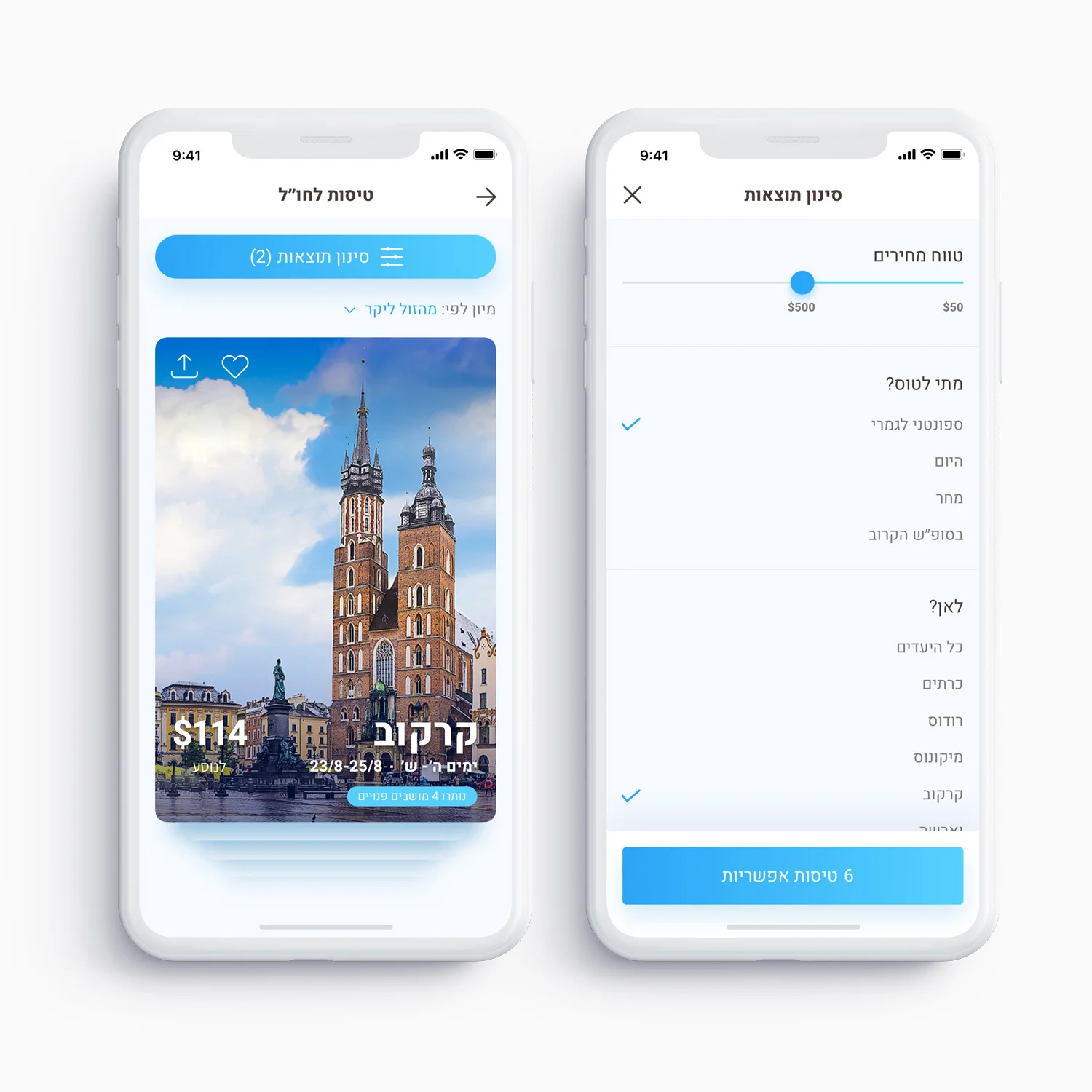
2. She is then directed to the flights screen. She swipes a few cards until she decides to filter some of the results.
3. She filters the flights to Europe for the weekend and sets a price range.
4. She returns to the filtered flights screen and presses the Krakow’s card to see details
5. The card expands all over the screen and reveals the flight details. The flight matches her needs so she decides to move to the next step
6. She is then directed to the buying process where she enters the details of her husband and herself and the payment method in order to book the flight.

Home Screen & Available Flights
The Home Screen now lets the users choose the type of vacation or service more easily, based on two main groups: local or abroad vacations.

Filterning Results
Once the users choose to view the available flights, the options are shown on cards which they explore via swiping and filtering options. This is designed that way in order to give the users a fun experience that bypasses the need to search, due to the limited availability of flights in the system.

Flight Details and Form Design
Once the users are interested in a flight, they are presented with all the needed information in order to advance to the ordering process. The number of passengers appears early in order to save steps in the form and make it shorter.

Minimum Info Required
Asking the Users to enter the minimum info needed in order to advance them towards the paying process and complete the purchase.

Bon Voyage
Once again, the users are needed to fill out the payment info with minimum effort until they are shown the final confirmation screen with the e-ticket and the option to share it with their vacation partners.
